Navy
Primary brand: headings, links, navy surfaces#f0f5fb #d9e3f3 #b3c7e7 #6088c0 #2966a8 #044a91 #033b75 #033672 #022a59 #012552 #001a3a Brand guide
One page that puts the entire brand on screen - logo, color, typography, signature details. Built for designers, partners and colleagues working with our visual identity. Every value here is pulled straight from our design tokens, so this page stays in sync with the live site automatically.
01 - Logo
The horizontal lockup (wordmark plus the let’s improve worklife line) in PNG and WebP at multiple resolutions. Avoid recoloring, distortion, or placement against busy backgrounds without enough contrast. A compact icon-only mark for very small / square contexts is on the roadmap.
02 - Color
Four primary families (navy, orange, teal, cream) plus an ink
scale for neutral text. Every stop is a design token. Prefer
the semantic name (--color-action-primary) over
the raw stop (--color-orange-500) - that
way the whole system shifts together if we ever revisit the
choice.
#044a91 --color-navy-500 #ff6e1d --color-orange-500 #69c4c4 --color-teal-400 #f4f4ed --color-cream-500 #f0f5fb #d9e3f3 #b3c7e7 #6088c0 #2966a8 #044a91 #033b75 #033672 #022a59 #012552 #001a3a #fff5ec #fde4d4 #fcc4a3 #fa9d6b #fa823f #ff6e1d #e15813 #b34108 #8a3309 #6e2a0c #eef9f9 #d4eded #aedede #87cece #69c4c4 #4ea5a5 #3d8585 #316969 #2a5454 #244545 #fefefb #fdfcf7 #faf8ef #f7f5e6 #f4f4ed #f4f4ed #ebe9d8 #d8d6c5 #b8b5a0 #f6f6f5 #e8e8e6 #c8c8c4 #a0a098 #6b6b65 #2a2a26 #1a1a1a #111111 #0a0a0a 03 - Typography
Two families. Helvetica Neue for everything that gets read (headings and body alike). IBM Plex Mono for labels, eyebrows, badges and code - anywhere we want a system-meta feel.
Sans
Aa Bb 123
Helvetica Neue
Mono
Aa Bb 123
IBM Plex Mono
Scale
04 - Signatures
Visual tells that make a page feel like Fanatics, even with the logo removed.
Every button sits on top of an offset stroke, our signature.
Solid teal or orange shadow, no blur. Gives cards a tactile, slightly-off-the-page feel.
Lists use an orange chevron-right instead of a dot. Direct, forward-pointing.
Section intros set in IBM Plex Mono, uppercase, with wide letter-spacing. Signals "this section belongs here".
Free Quickscan
Are you paying more for software than it’s worth to you?
Short status labels in mono - navy, orange, teal or outline.
Subtle 40px grid in 4% navy. Texture, not decoration - only used on cream or inverse navy.
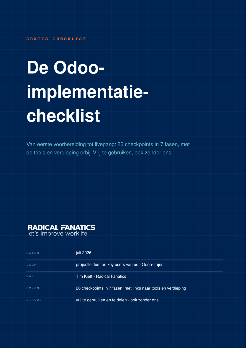
05 - Document covers
Every PDF that leaves the building - solution assessments, checklists, proposals - opens with the same blueprint cover. Calm, technical, and unmistakably ours.
SOLUTION ASSESSMENT, GRATIS CHECKLIST./brand/logo-white-360.png), ±170pt wide. Never set the wordmark as text.DATUM · VOOR · VAN · OMVANG · STATUS.#012452 - deeper than navy-500, covers only.#092b58, 1px lines on a 30pt raster.Living examples: NL · EN · DE · Samenvatting (WeasyPrint)
Grid rendering. Do not use CSS
repeating-linear-gradient for the blueprint grid -
WeasyPrint renders it at the wrong scale (oversized squares).
Use the pre-rendered tile:
.cover {
background-color: #012452;
background-image: url('/brand/grid-tile-30pt.png');
background-size: 30pt 30pt;
background-repeat: repeat;
}
The tile (/brand/grid-tile-30pt.png)
is 120×120px: background #012452 with 3px lines
#092b58 on the top and left edges, used at 30pt × 30pt.
Verification (required before sending). Rasterize page 1 of the output PDF at 72 dpi and confirm the grid lines sit exactly 30px apart. Wrong pitch = wrong implementation.
Cover layout. Flex column, padding 64pt: doc-type
eyebrow (mono, uppercase, letterspaced, orange-500) → title
(Helvetica Neue Bold ±42pt, pure white, max 3 lines) →
subtitle hook (teal-400 #69c4c4, 13pt) → deliberate
empty middle (flex: 1) → white logo
/brand/logo-white-360.png at 170pt → metadata table
(mono labels 8pt teal-400, white values, hairlines
rgba(255,255,255,0.2)).
Inner pages. Background cream #f4f4ed;
callouts as white cards with an orange left border and a hard offset
shadow (#d8d6c5). No offset shadows on covers.
Body text - documents differ from the web on purpose.
On the site body copy is navy-700 (--color-text-primary).
In a document it is ink-500 #2a2a26, with meta and footers
in ink-400 #6b6b65. Both are tokens from
primitive.css; this is a medium rule, not a deviation. A web
page carries short paragraphs surrounded by whitespace, so navy body reads
as one calm voice. A dense A4 full of tables, callouts and bold navy
lead-ins does not: set everything in navy and the page turns into one blue
mass where headings stop reading as headings. Ink body against navy
headings keeps the hierarchy scannable, which is what a document is for.
Never use #6B7280 for muted text - that is a Tailwind grey
that slipped into an early template, not a Fanatics token.
List bullets. Same orange chevron-right as the
.chevron-list utility in global.css, but
WeasyPrint does not support mask-image. Inline the
Lucide path as a background SVG with the colour baked in - never
substitute a square, a dot or an arrow:
ul li { padding-left: 1.5em; position: relative; }
ul li::before {
content: ''; position: absolute; left: 0; top: 0.35em;
width: 1em; height: 1em;
background-image: url("data:image/svg+xml;utf8,<svg xmlns='http://www.w3.org/2000/svg'
viewBox='0 0 24 24' fill='none' stroke='%23ff6e1d' stroke-width='3'
stroke-linecap='round' stroke-linejoin='round'><polyline points='9 18 15 12 9 6'/></svg>");
background-repeat: no-repeat; background-size: contain;
} Page footers. Give the page box a fixed height and
position the footer absolutely (bottom: 13mm). Left in
the text flow it rides up and sticks to the last paragraph on short
pages.
Living example: living-example-samenvatting.pdf - generated, not designed. The HTML source next to it is the reference implementation.

06 - Document interior pages
The cover (section 05) is half the document. The interior pages follow one fixed recipe too - a document that nails the cover but improvises the inside is still off-brand. If you are generating a document, follow this list literally, top to bottom.
#f4f4ed on every interior page. Never pure white, never navy.01 - WAT WE HEBBEN GEHOORD, 02 - WAAR HET WRINGT. This is the document's backbone.› in orange-500, lead-in words bold navy, rest regular.Radical Fanatics · Amsterdam · fanatics.nl - [document] · pagina N. The footer is anchored to the bottom of the page at a fixed position - never placed directly under the last line of text. A page that is half empty still has its footer at the very bottom.The living examples under section 05 show cover and interior: checklist NL · samenvatting (WeasyPrint). Reproduce those pages, swap the content.
Keep exploring
Buttons in every variant and size, forms, cards, badges, inputs, video embeds - everything we ship on the site, on one page, ready to copy.